


Bored Panda
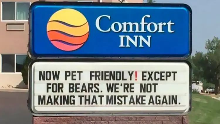
A funny Comfort Inn hotel sign design reading, Now pet friendly except for bears, as an example of how to design a sign.
Funny,FailsNOV 7, 2026

86 Times Sign Design Went Absolutely Wrong, And People Just Needed To Share It Online

50
5
Whether you’re stuck in traffic or taking a quick stroll through the neighborhood, street signs, billboards, and posters usually fade into the background. Every once in a while, though, a sign demands your full attention — usually for all the wrong reasons.
Sometimes it’s genius, intentional comedy — like a missing poster featuring a Golden Retriever proudly holding a stolen garden gnome in its mouth. Other times, it’s a complete design disaster — with spelling or grammar mistakes, or chaotic word placements.
If your day could use a pick-me-up, we’ve rounded up some of the most ridiculous, silly, and hilarious signs spotted in the wild and shared by the eagle-eyed members of a popular Facebook group. Dive in, and don’t forget to see the signs on your next walk.
#21

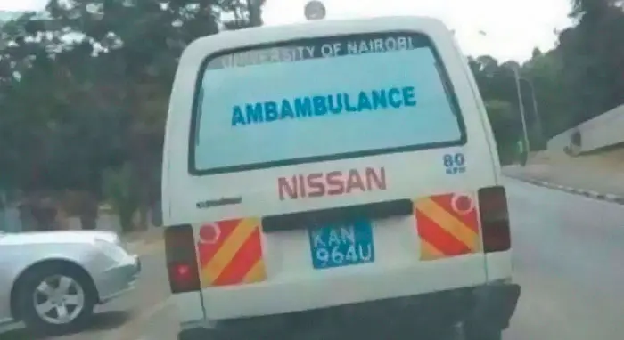
A poorly planned design for a sign on the back of a van misspelled as Ambambulance.
38points

Not every funny sign is planned. In fact, the best ones are completely accidental — born from typos, terrible spelling, or bad word placement.

We find them funny because our brains naturally crave order. We expect text to read smoothly from left to right, matching the rules we’ve known forever. But when a sign painter drops a critical letter, swaps two words, or wraps text awkwardly around a building pillar, that smooth rhythm shatters.

These silly signs do more than just make us laugh, though. They remind us that behind all our polished technology and tools, real life is still run by flawed, distracted, witty, and creative human beings.
#22

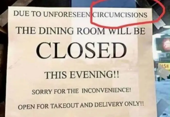
A printed notice sign design with a hilarious typo for circumstances
38points

#23

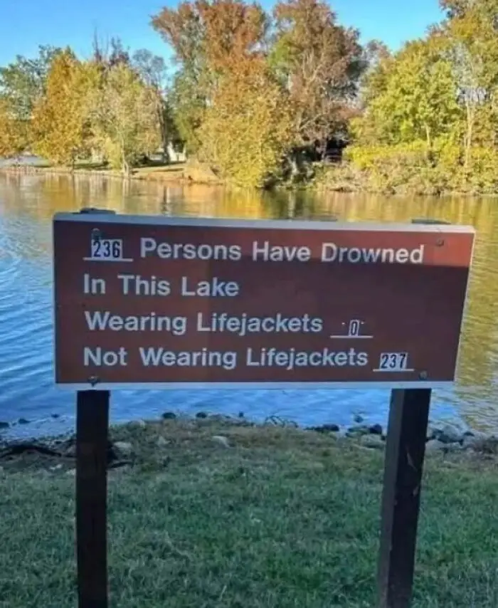
A poorly designed lake safety sign showing incorrect math totals for drowning statistics.
36points

#24

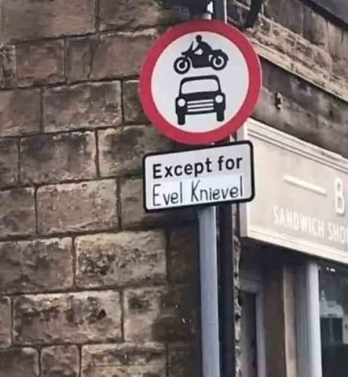
Road traffic sign with a funny custom text addition underneath to design a sign humorously.
35points

#25

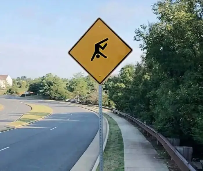
Yellow road sign depicting a cartwheeling stick figure, an example of a senseless sign design.
Report
31points

#26

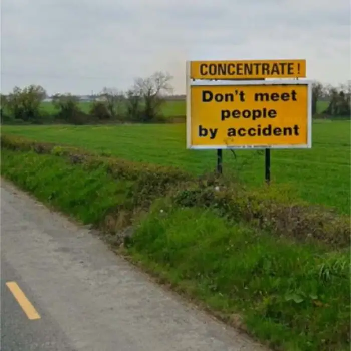
A poorly worded road safety sign reading, Concentrate! Don't meet people by accident.
31points

#27

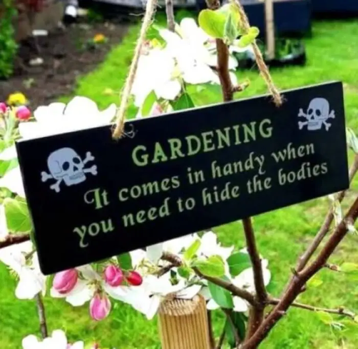
A dark garden plaque hanging from a tree with dark humor text about hiding bodies to design a sign amusingly.
31points

#28

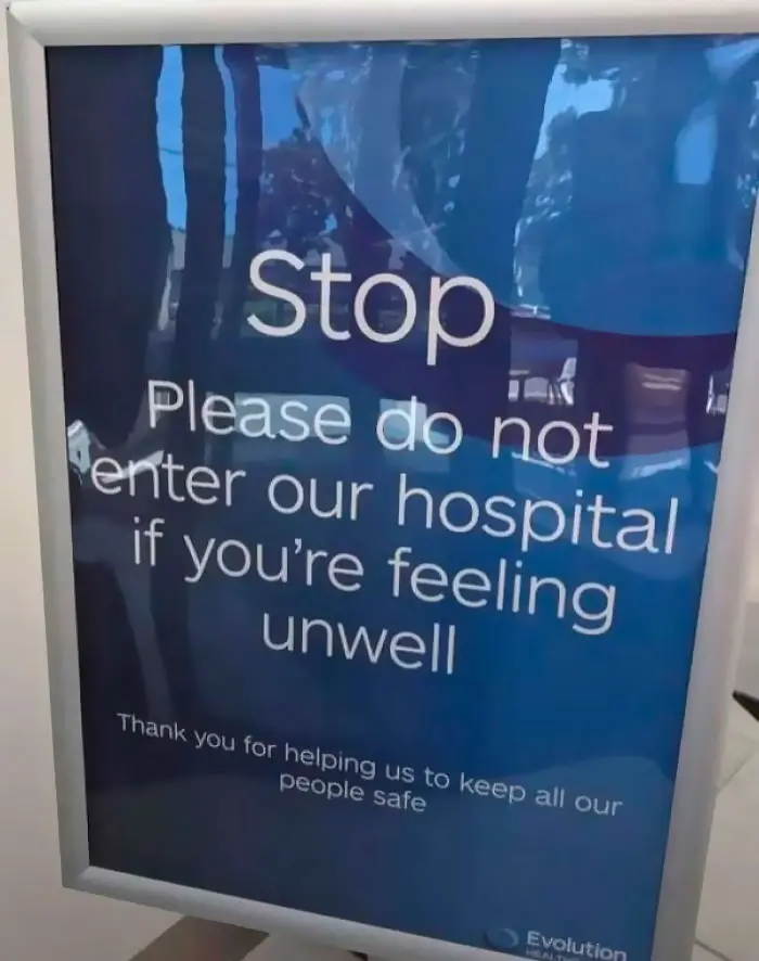
A senseless sign outside a hospital that bizarrely asks people not to enter if they are feeling unwell.
29points

#29

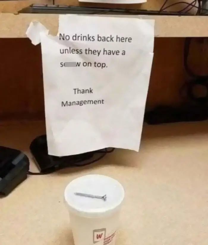
A coffee cup with a literal metal screw on top following a misspelled management sign.
29points

#30

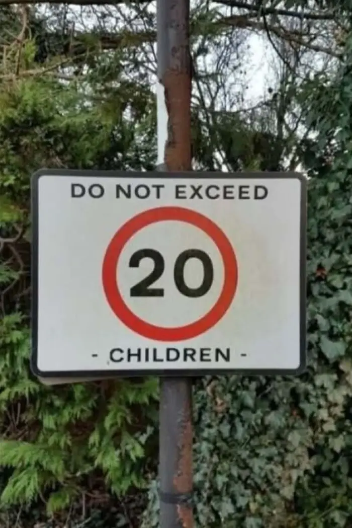
A road speed limit sign with confusing text layout showing an odd attempt to design a sign.
29points

#31

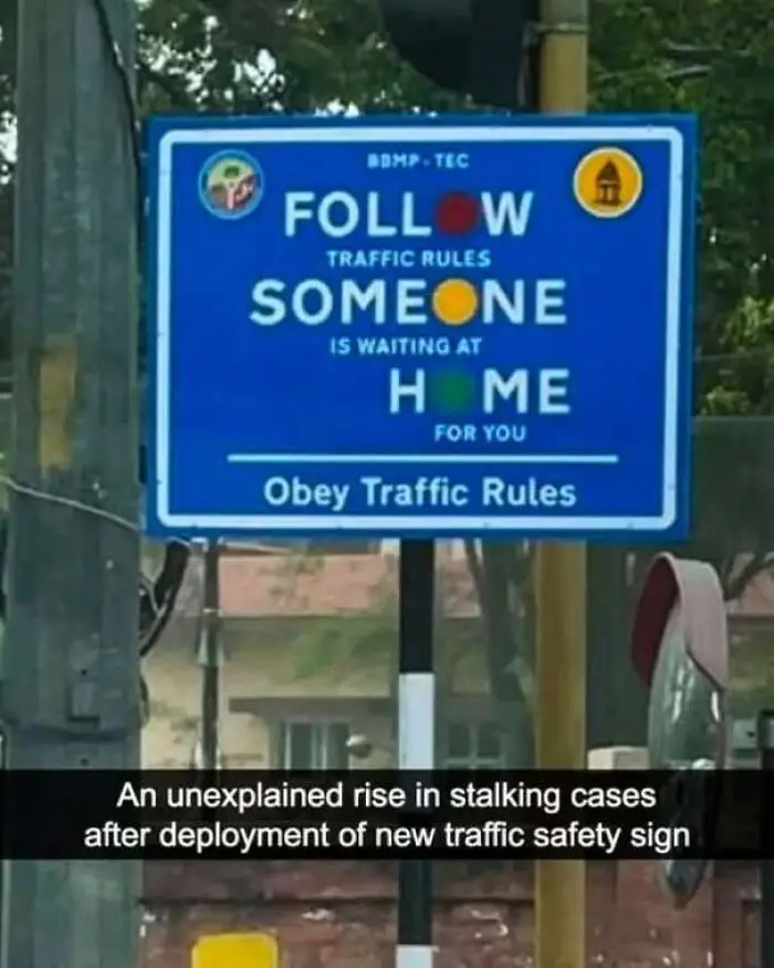
A blue traffic safety sign design with a confusing letter layout
28points

#32

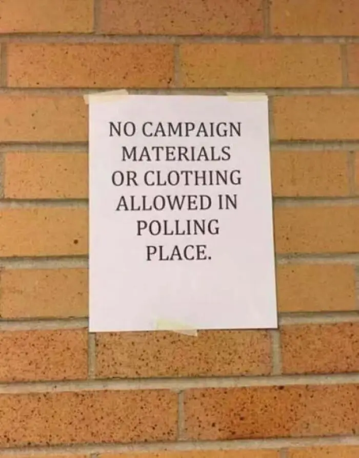
A poorly worded notice on a brick wall illustrating how not to design a sign.
28points

#33

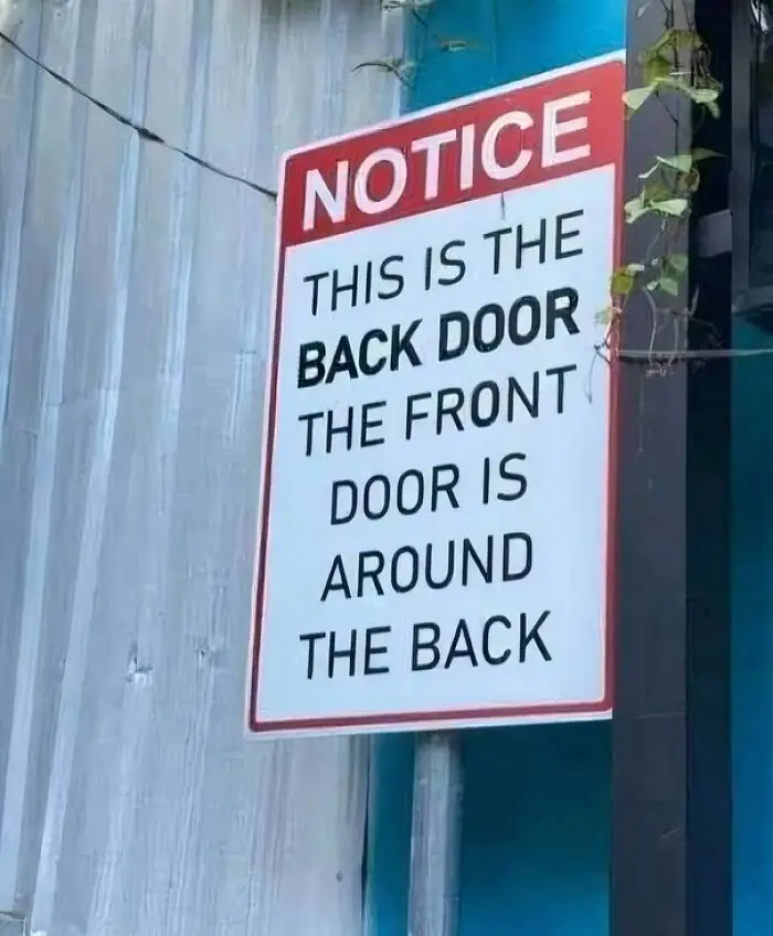
A poorly thought out sign placed outside that confusingly explains the location of the front and back doors.
27points

#35

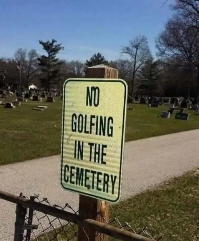
A sign placed in a graveyard that reads NO GOLFING IN THE CEMETERY illustrating a strange way to design a sign.
26points

#36

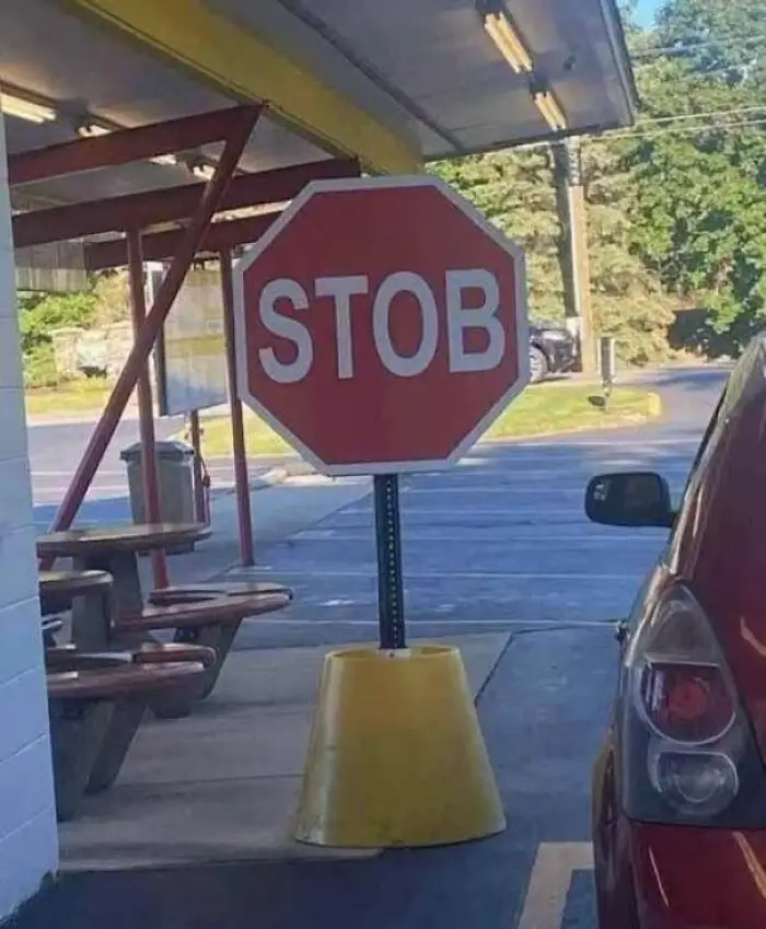
Misspelled stop sign that reads STOB in front of a drive-thru.
26points

#37

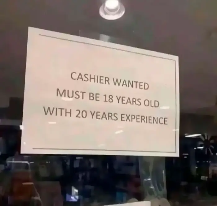
A job hiring window notice demonstrating an impossible requirement when people design a sign
25points

#38

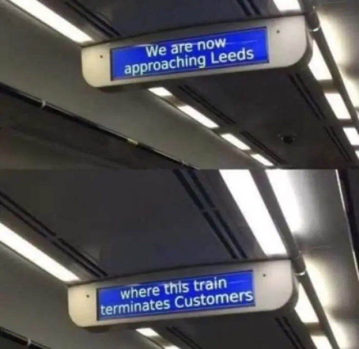
Train screen displays an ominous message about terminating customers showcasing a poorly designed sign
25points

#39

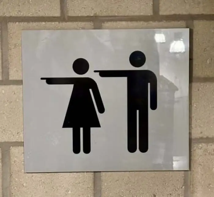
Confusing restroom sign showing male and female pictograms pointing horizontally in opposite directions.
25points

#40

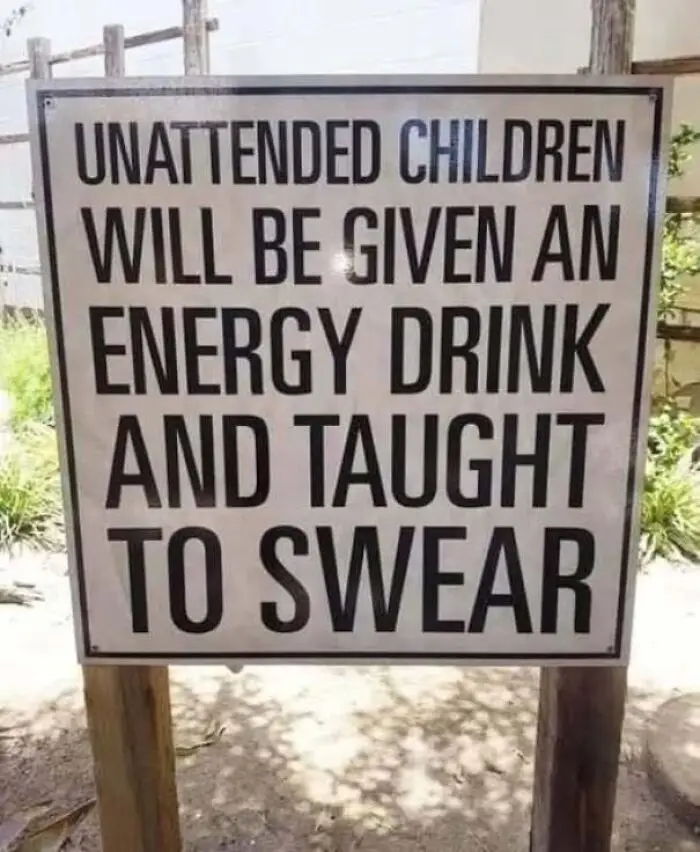
Warning notice with bold text stating consequences for unattended kids to design a sign with humor.
Report
24points
50
5