


Bored Panda
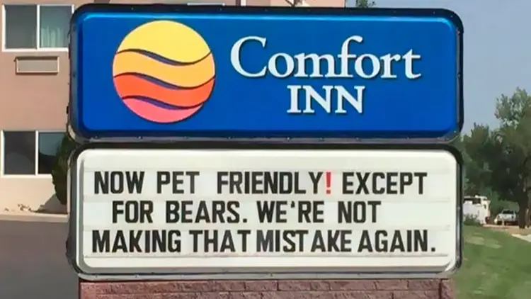
A funny Comfort Inn hotel sign design reading, Now pet friendly except for bears, as an example of how to design a sign.
Funny,FailsNOV 7, 2026

86 Times Sign Design Went Absolutely Wrong, And People Just Needed To Share It Online

50
5
Whether you’re stuck in traffic or taking a quick stroll through the neighborhood, street signs, billboards, and posters usually fade into the background. Every once in a while, though, a sign demands your full attention — usually for all the wrong reasons.
Sometimes it’s genius, intentional comedy — like a missing poster featuring a Golden Retriever proudly holding a stolen garden gnome in its mouth. Other times, it’s a complete design disaster — with spelling or grammar mistakes, or chaotic word placements.
If your day could use a pick-me-up, we’ve rounded up some of the most ridiculous, silly, and hilarious signs spotted in the wild and shared by the eagle-eyed members of a popular Facebook group. Dive in, and don’t forget to see the signs on your next walk.

#81

A restaurant menu with a misspelled word showing a poorly designed sign.
5points

#82

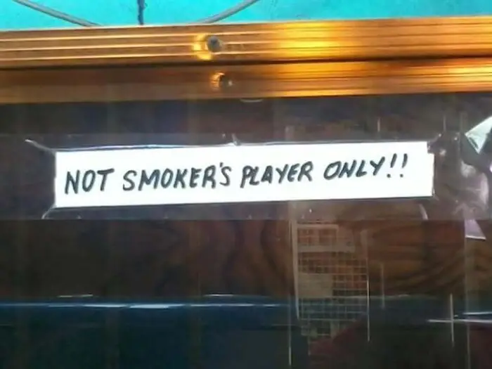
A handwritten notice taped to glass demonstrating confusing grammar when people design a sign
Report
3points

#83

Black t-shirt with paint-stroke typography showing how to design a sign with typo-filled text.
3points

#84

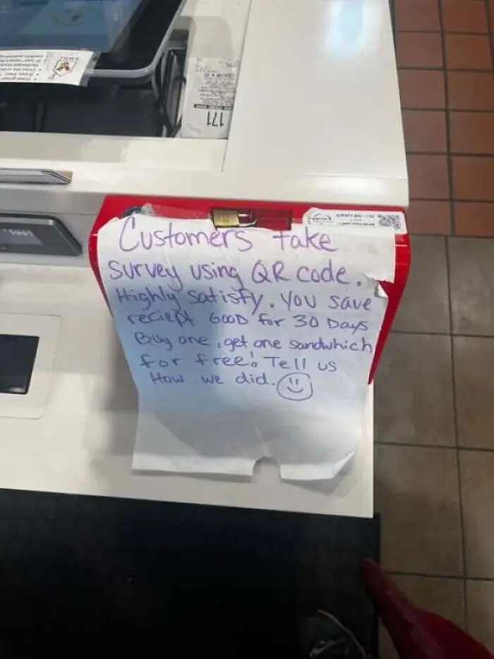
Handwritten paper instruction note attached to a register showing a senseless sign design.
2points

#85

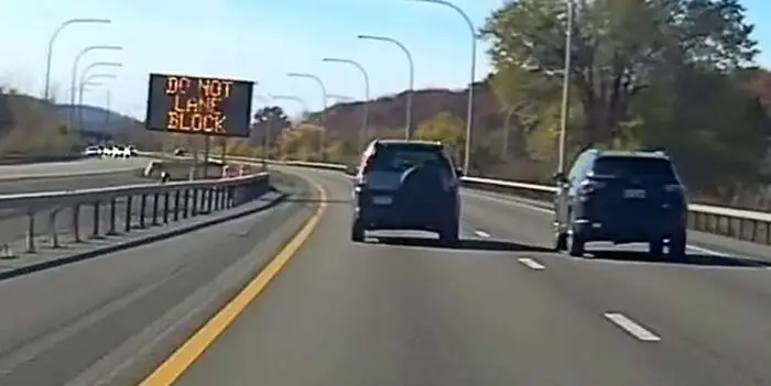
Highway electronic traffic sign displaying confusing text as an example of how to design a sign poorly
1point

#86

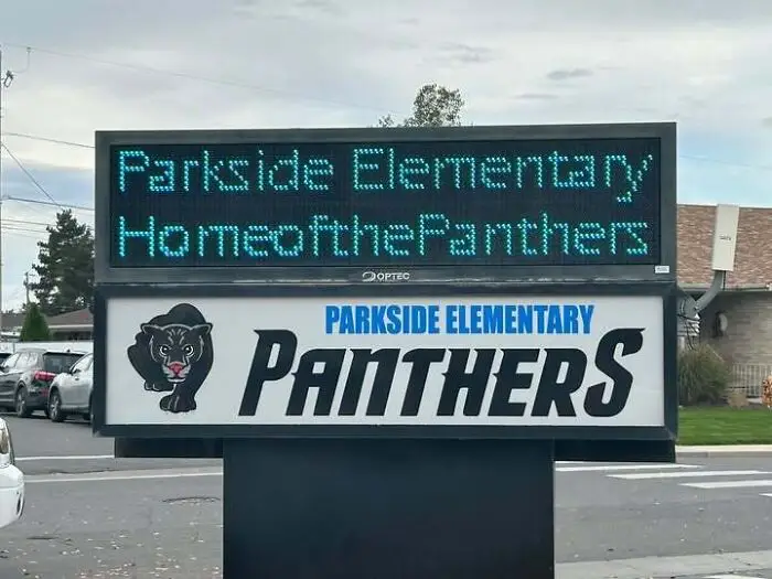
A sign design for Parkside Elementary displaying text without any spaces
1point
50
5